El secreto para entender el círculo cromático: La clave del color en la ilustración
¿Alguna vez te has preguntado por qué algunas ilustraciones parecen saltar de la página mientras otras se sienten planas y sin vida? La respuesta podría estar en un simple círculo. El círculo cromático, esa herramienta aparentemente sencilla, esconde secretos que pueden transformar tus creaciones artísticas. En este artículo, desentrañaremos los misterios del círculo cromático y te mostraremos cómo puede revolucionar tu enfoque del color en el dibujo y la ilustración.
Prepárate para sumergirte en un mundo de colores vibrantes, combinaciones armoniosas y técnicas que elevarán tus habilidades artísticas a nuevas alturas. ¿Estás listo para descubrir el poder oculto del círculo cromático? ¡Sigue leyendo y desbloquea el potencial cromático de tus creaciones!
Por Nicole Goodnames
El círculo cromático: La brújula del artista en el universo del color
El círculo cromático es mucho más que una simple rueda de colores; es una herramienta poderosa que ha guiado a artistas durante siglos. Imagina tener un mapa que te muestra todas las posibilidades cromáticas al alcance de tu mano. Eso es exactamente lo que el círculo cromático ofrece a los ilustradores y dibujantes.
Esta representación gráfica organiza los colores según su tono y matiz, revelando relaciones fascinantes entre ellos. Es como tener un lenguaje secreto del color a tu disposición, permitiéndote crear combinaciones que resuenan con el espectador a un nivel casi instintivo.
Pero el verdadero poder del círculo cromático radica en su versatilidad. Existen varios tipos, cada uno ofreciendo una perspectiva única sobre cómo los colores interactúan entre sí. Desde el más básico hasta el más complejo, todos comparten un principio fundamental: la formación de colores a partir de combinaciones entre sí.
Para dominar este arte, debemos comenzar por lo básico: los colores primarios. Estos son los cimientos sobre los que se construye todo el espectro cromático. A partir de ahí, un mundo de posibilidades se despliega ante nuestros ojos, esperando ser explorado y aplicado en nuestras creaciones.
¿Quieres llevar tus ilustraciones al siguiente nivel? Descubre aquí cómo dominar el arte del color en tus dibujos y desbloquea todo tu potencial creativo.
Descifrando el código del color: Imágenes que iluminarán tu comprensión
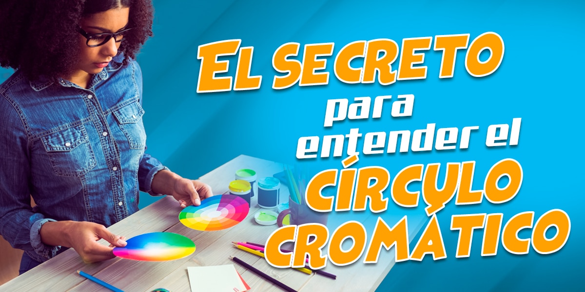
Observa atentamente esta imagen. Los colores que ves destacados son el Rojo, Azul y Amarillo. Estos son los famosos colores primarios, los pilares fundamentales de toda paleta cromática. ¿Por qué son tan especiales? Porque son los únicos que no pueden obtenerse mezclando otros colores. Son puros, originales, los bloques de construcción de todo el espectro visible.
Imagina estos colores como los ingredientes básicos en la cocina de un chef. Al igual que la harina, los huevos y la leche son la base de innumerables recetas, los colores primarios son el punto de partida para toda una gama de posibilidades cromáticas. Dominarlos es el primer paso para convertirte en un verdadero maestro del color.
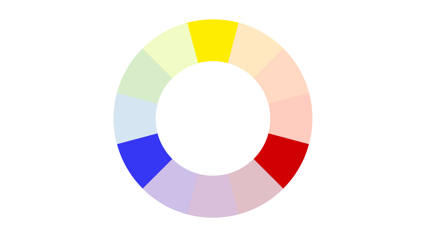
Ahora, pasemos al siguiente nivel de nuestra exploración cromática. En esta imagen, podemos apreciar los colores secundarios, esos tonos vibrantes que surgen de la mezcla de los primarios. Verde, naranja y violeta emergen como por arte de magia, abriendo un nuevo abanico de posibilidades para nuestras creaciones.
Sin embargo, es importante notar que la calidad y viveza de estos colores secundarios dependen en gran medida de los pigmentos primarios utilizados. Por ejemplo, el violeta que ves en la imagen puede ser difícil de replicar exactamente mezclando un rojo y un azul comunes. Esto nos enseña una lección valiosa: la importancia de la calidad de los materiales en el arte del color.
Experimentar con diferentes pigmentos y marcas puede llevarte a descubrir combinaciones únicas y personales. Haz clic aquí para explorar técnicas avanzadas de mezcla de colores y lleva tus ilustraciones a un nuevo nivel de expresión.
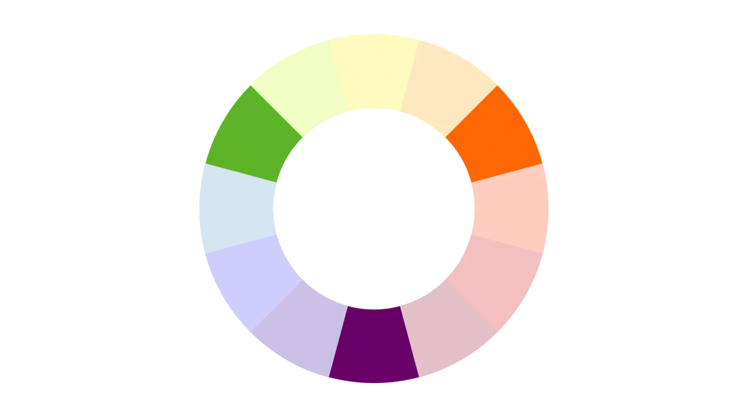
Adentrémonos ahora en el fascinante mundo de los colores terciarios. Estos surgen de la mezcla entre un color primario y un secundario adyacente en el círculo cromático. Aquí es donde la magia del color realmente comienza a brillar, ofreciendo una paleta rica y matizada que puede dar vida a cualquier ilustración.
La variabilidad de tonos en los colores terciarios es asombrosa. Cada pequeño ajuste en las proporciones de mezcla puede resultar en un tono completamente nuevo y único. Es como tener un laboratorio de color en tus manos, donde puedes experimentar y descubrir combinaciones que nadie ha visto antes.
Un consejo de experto: presta especial atención al amarillo cuando trabajes con colores terciarios. Este color primario tiene la peculiaridad de requerir mayores cantidades para lograr el efecto deseado en las mezclas. Dominar esta particularidad te permitirá crear tonos terciarios más precisos y vibrantes.
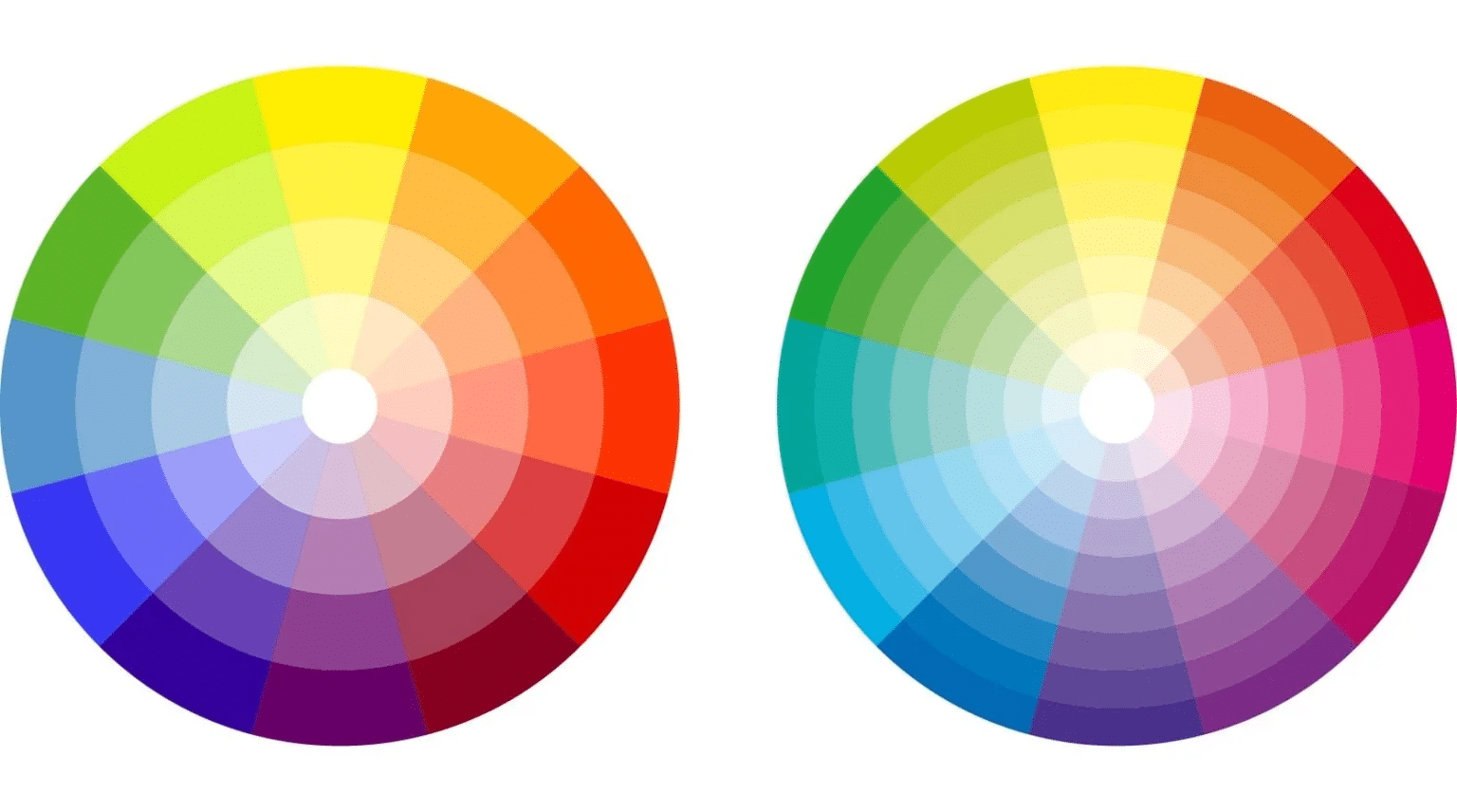
Finalmente, contemplamos el círculo cromático en toda su gloria. Con 3 colores primarios, 3 secundarios y 6 terciarios, tenemos ante nosotros una herramienta completa para la selección y combinación de colores. Este círculo es como un mapa del tesoro para los artistas, revelando relaciones y posibilidades que pueden transformar cualquier obra.
Observa cómo cada color se relaciona con los demás. Las posiciones en el círculo no son aleatorias; reflejan las conexiones intrínsecas entre los tonos. Entender estas relaciones es la clave para crear paletas armoniosas y efectos visuales impactantes en tus ilustraciones.
¿Listo para aplicar este conocimiento en tus propias creaciones? Ingresa aquí para acceder a recursos que te ayudarán a perfeccionar tu dominio del círculo cromático y elevar tu arte a nuevas alturas.
Desvelando los secretos del círculo cromático: Combinaciones que transformarán tu arte
Ahora que hemos explorado la estructura del círculo cromático, es momento de revelar cómo puedes utilizarlo para crear combinaciones de colores que harán que tus ilustraciones cobren vida. El verdadero poder de esta herramienta radica en su capacidad para guiarte hacia elecciones cromáticas armoniosas y efectivas.
El poder de los opuestos complementarios
Imagina trazar una línea recta a través del centro del círculo cromático. Los colores que conecta esta línea son opuestos complementarios. Por ejemplo, el rojo y el verde, o el azul y el naranja. Estos pares de colores tienen una relación especial: se intensifican mutuamente cuando se colocan juntos, creando un contraste vibrante y llamativo.
Utilizar opuestos complementarios en tus ilustraciones puede añadir un dinamismo instantáneo. Son particularmente efectivos para crear sombras y luces, ya que cada color complementa y realza al otro. En el diseño de personajes, por ejemplo, puedes usar un color para la ropa y su complementario para las sombras, creando una profundidad y dimensión sorprendentes.
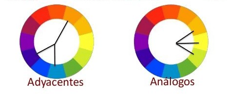
La armonía de los colores análogos
Los colores análogos son aquellos que se encuentran uno al lado del otro en el círculo cromático. Utilizar una paleta de colores análogos puede crear una sensación de armonía y cohesión en tu obra. Esta técnica es especialmente útil para crear ambientes o escenas con una atmósfera específica.
Prueba seleccionando tres o cuatro colores adyacentes en el círculo. Verás cómo tu ilustración adquiere una coherencia visual inmediata. Esta técnica es muy apreciada en el diseño de cómics y series de ilustraciones, donde mantener una paleta consistente a lo largo de múltiples páginas o imágenes es crucial para la narrativa visual.
¿Quieres llevar tus habilidades de coloración al siguiente nivel? Explora aquí técnicas avanzadas de color para ilustración y cómics y descubre cómo crear obras que cautiven a tu audiencia.
La versatilidad de los colores adyacentes
Una variación interesante de la técnica de opuestos complementarios es el uso de colores adyacentes. En lugar de seleccionar el color directamente opuesto en el círculo, elige los dos colores que flanquean al complementario. Esta técnica crea una paleta más rica y variada, manteniendo al mismo tiempo el impacto visual del contraste.
Por ejemplo, si estás trabajando con azul, en lugar de usar solo naranja (su complementario), podrías incorporar tonos de amarillo-naranja y rojo-naranja. Esta aproximación ofrece más flexibilidad y puede resultar en combinaciones más sutiles y sofisticadas.
Esta imagen ilustra perfectamente cómo diferentes combinaciones basadas en el círculo cromático pueden crear efectos visuales distintos. Observa cómo cada paleta evoca una emoción o atmósfera única. Experimentar con estas combinaciones te permitirá encontrar la paleta perfecta para cada proyecto, sea una ilustración vibrante, un cómic atmosférico o un diseño de personaje memorable.
Recuerda, el círculo cromático es una guía, no una regla estricta. A medida que te familiarices con estos principios, sentirás la confianza para experimentar y desarrollar tu propio estilo cromático único. La práctica constante y la experimentación son clave para dominar el arte del color.
¿Estás listo para aplicar estos conocimientos en tu próxima obra maestra? Descubre aquí recursos adicionales para perfeccionar tu uso del color en la ilustración y lleva tus creaciones al siguiente nivel.
Más allá del círculo: Aplicaciones prácticas en la ilustración
Comprender el círculo cromático es solo el comienzo. La verdadera magia ocurre cuando empiezas a aplicar este conocimiento en tus proyectos de ilustración. Veamos algunas formas prácticas de utilizar lo que has aprendido para mejorar tus creaciones artísticas.
Creando atmósferas con el color
El color tiene el poder de establecer el tono emocional de una ilustración. Utilizando los principios del círculo cromático, puedes crear atmósferas específicas que complementen la narrativa de tu obra. Por ejemplo:
- Colores cálidos (rojos, naranjas, amarillos) pueden evocar energía, pasión o calidez.
- Colores fríos (azules, verdes, violetas) pueden sugerir calma, misterio o melancolía.
- Combinaciones de colores complementarios pueden crear tensión o drama visual.
Experimenta con diferentes paletas basadas en el círculo cromático para ver cómo afectan la percepción de tus escenas o personajes. ¿Quieres dominar el arte de crear atmósferas con color? Haz clic aquí para explorar técnicas avanzadas y lleva tus ilustraciones al siguiente nivel.
Diseño de personajes con impacto
El círculo cromático es una herramienta invaluable para el diseño de personajes. Puedes usar combinaciones de colores para:
- Reflejar la personalidad del personaje (colores vibrantes para personajes extrovertidos, tonos más suaves para los introvertidos).
- Crear contraste entre personajes en una misma escena.
- Establecer coherencia visual en una serie de personajes relacionados.
Recuerda que los colores que elijas para tus personajes pueden influir significativamente en cómo la audiencia los percibe y se relaciona con ellos.
Narrativa visual en cómics e historietas
En el mundo del cómic, el color es una herramienta narrativa poderosa. Puedes usar el círculo cromático para:
- Diferenciar escenas o capítulos utilizando paletas distintas.
- Guiar el ojo del lector a través de la página usando contrastes de color.
- Representar cambios de tiempo o estado de ánimo mediante transiciones graduales de color.
La consistencia en el uso del color a lo largo de una historieta puede mejorar significativamente la experiencia de lectura y reforzar la narrativa.
Experimentación y desarrollo de estilo propio
A medida que te familiarices con el círculo cromático y sus aplicaciones, comenzarás a desarrollar tu propio estilo de color. No temas experimentar con combinaciones inusuales o romper las reglas de vez en cuando. Algunos de los artistas más innovadores han creado estilos únicos desafiando las convenciones del color.
Prueba a crear paletas personalizadas basadas en tus colores favoritos o en emociones específicas que quieras transmitir. Mantén un diario de color donde puedas registrar combinaciones interesantes que encuentres en tu día a día. Con el tiempo, desarrollarás un ojo agudo para el color que se reflejará en todas tus creaciones.
¿Listo para elevar tu arte al siguiente nivel? Descubre aquí recursos para perfeccionar tu estilo único de color y destaca en el mundo de la ilustración.
El círculo cromático en la era digital
En la era digital, el círculo cromático sigue siendo tan relevante como siempre, pero ahora tenemos herramientas adicionales a nuestra disposición. Los software de diseño e ilustración ofrecen círculos cromáticos interactivos y paletas de color personalizables que pueden ampliar enormemente nuestras posibilidades creativas.
Herramientas digitales para la selección de color
Muchos programas de diseño gráfico e ilustración digital incluyen herramientas basadas en el círculo cromático. Estas pueden ayudarte a:
- Generar paletas de color armoniosas con un solo clic.
- Ajustar la saturación y el brillo manteniendo la armonía de color.
- Explorar variaciones de color rápidamente para encontrar la combinación perfecta.
Aprovecha estas herramientas para experimentar con diferentes esquemas de color de manera eficiente. Sin embargo, recuerda que la tecnología es un complemento, no un sustituto, de tu comprensión fundamental del color.
Adaptación del color para diferentes medios
En el mundo digital, es crucial considerar cómo se verán tus colores en diferentes dispositivos y plataformas. Lo que parece perfecto en tu monitor puede verse diferente en un teléfono móvil o en una impresión física. Algunos consejos para manejar esto:
- Familiarízate con los diferentes espacios de color (RGB para digital, CMYK para impresión).
- Prueba tus diseños en varios dispositivos para asegurar la consistencia.
- Considera cómo los diferentes formatos de archivo pueden afectar la reproducción del color.
Entender estas consideraciones técnicas te ayudará a asegurar que tus creaciones se vean tan vibrantes en la pantalla como en el papel.
Conclusión: El poder transformador del círculo cromático
Hemos recorrido un viaje fascinante a través del mundo del color, descubriendo los secretos ocultos en el simple pero poderoso círculo cromático. Desde los fundamentos de los colores primarios hasta las complejas relaciones entre tonos complementarios y análogos, hemos visto cómo esta herramienta puede revolucionar tu enfoque del color en la ilustración y el dibujo.
Recuerda, el círculo cromático no es solo una guía teórica; es una llave que abre un mundo de posibilidades creativas. Ya sea que estés diseñando personajes vibrantes, creando atmósferas envolventes en tus cómics, o buscando tu estilo único como ilustrador, el dominio del color a través del círculo cromático te dará una ventaja incomparable.
La próxima vez que te enfrentes a un lienzo en blanco o a una pantalla vacía, piensa en el círculo cromático como tu aliado secreto. Experimenta con diferentes combinaciones, juega con los contrastes, y no temas romper las reglas de vez en cuando. Después de todo, el arte trata de expresión y creatividad.
¿Estás listo para llevar tus habilidades de color al siguiente nivel? Haz clic aquí para descubrir recursos adicionales y técnicas avanzadas que te ayudarán a dominar el arte del color en la ilustración. Tu próxima obra maestra te espera, ¡es hora de darle vida con el poder del color!


