
Un truco para dominar el arte del dibujo a color
¿Alguna vez te has preguntado cómo los artistas logran crear ilustraciones tan vibrantes y llenas de vida? El secreto está en el dominio del color. En este artículo, te revelaremos un truco fascinante para aprender a dibujar con colores que transformará tus creaciones. Prepárate para sumergirte en el mundo de la teoría del color, explorando conceptos clave como el valor tonal, luces, sombras y la selección de la paleta perfecta.
Descubrirás la magia que se esconde detrás de cada trazo colorido y cómo puedes aprovecharla para elevar tus ilustraciones al siguiente nivel. Ya sea que prefieras trabajar en escala de grises o con una explosión de colores, este truco te ayudará a comprender y aplicar los principios fundamentales que hacen que una obra destaque.
Al final de este viaje cromático, no solo habrás adquirido conocimientos valiosos, sino que también te proporcionaremos un ejercicio práctico para que puedas poner a prueba tus nuevas habilidades. ¿Estás listo para desbloquear todo tu potencial artístico? ¡Sigue leyendo y prepárate para ver el mundo del dibujo con nuevos ojos!
Por Castillo
La llave maestra: Descifrando la teoría del color de forma sencilla
Para muchos artistas, el color representa un desafío formidable. A menudo, su uso se basa más en la intuición que en un conocimiento sólido. Sin embargo, dominar el color es esencial para llevar nuestras ilustraciones al siguiente nivel, convirtiéndose en una necesidad para todo aquel que busca destacar en el mundo del arte.
Hoy te presentamos una técnica sorprendentemente simple pero increíblemente efectiva para comprender los conceptos fundamentales de la teoría del color. Esta herramienta te permitirá explorar cómo los tonos de tu paleta pueden trabajar en armonía para crear ilustraciones impactantes y expresivas.
Antes de sumergirnos en esta técnica revolucionaria, es crucial que repasemos un concepto fundamental: el “VALOR”. Este elemento es la piedra angular para comprender cómo funcionan la luz y la sombra en nuestras creaciones. ¿Quieres descubrir cómo dominar el valor en tus ilustraciones? Haz clic aquí para explorar más.
El valor tonal: La clave para dar vida a tus dibujos
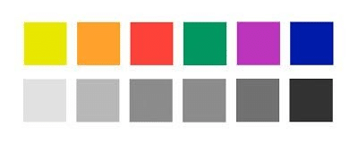
El valor, en el contexto del dibujo y la pintura, se refiere al grado de claridad u oscuridad de un color. Es, en esencia, la luminosidad que percibimos en las superficies. Para comprender mejor las diferencias de valor, los artistas suelen utilizar una escala de grises como referencia. En esta escala, el blanco y el negro representan los extremos, mientras que los diversos tonos de gris se distribuyen entre ambos.
Este concepto de “valores” es fundamental en la teoría del color y se relaciona directamente con nuestra capacidad para controlar y variar los tonos de gris en nuestros dibujos. En última instancia, los valores en nuestras creaciones son un indicador de la luz y representan la luminosidad equivalente de los colores en las superficies que estamos representando.
El baile entre el valor y el color: Una sinfonía visual
Es importante entender que el valor no es exclusivo del blanco, negro y gris. Cada color posee su propio valor inherente. Por ejemplo, el amarillo tiene naturalmente un valor claro, mientras que el violeta tiende a ser más oscuro. Sin embargo, cualquier color puede recorrer toda la escala de valores, desde el más claro hasta el más oscuro, dependiendo de cómo lo manipulemos.
Armados con este conocimiento, nos embarcaremos en un ejercicio fascinante: crearemos un dibujo utilizando colores puros, tal como vienen en nuestros materiales, sin mezclas ni preparaciones previas. Este enfoque nos permitirá experimentar de manera práctica y directa con la teoría que acabamos de aprender.
Esta técnica no solo es impactante visualmente, sino también increíblemente rápida de ejecutar. Nos da la libertad de trabajar con los colores de forma intuitiva, quizás alejándonos del “color local” de los objetos, pero logrando resultados sorprendentemente agradables y expresivos una vez que dominamos el método.
Cuando hablamos de “color local”, nos referimos al tono natural que tienen los objetos en la realidad. Por ejemplo, asociamos el cielo con el azul y el tronco de un árbol con el marrón. En las representaciones naturalistas, se busca mantener esta relación lo más fielmente posible.
Sin embargo, existe otra aproximación conocida como “Color Arbitrario”. En este enfoque, nos liberamos de las restricciones del color local y nos permitimos pintar cualquier objeto con el tono que elijamos, sin buscar una relación directa con la realidad. Así, podríamos tener un cielo verde y un tronco azul si así lo deseamos.
Este método, que ganó popularidad con los movimientos expresionistas y fauvistas de las vanguardias artísticas, es el que exploraremos en nuestro ejercicio. Dejaremos de lado las convenciones del color local y trabajaremos con una paleta reducida, guiados por nuestra intuición y sentido del diseño. ¿Listo para llevar tus habilidades de color al siguiente nivel? Descubre más técnicas aquí.
Con estas posibilidades en mente, es hora de reunir nuestros materiales y dar rienda suelta a nuestra creatividad. ¡Prepárate para una experiencia artística transformadora!
Tu kit de herramientas para la exploración cromática
Para embarcarnos en esta aventura artística, necesitaremos reunir los siguientes materiales:
- Bloc de hojas de color (adecuado para dibujo con lápiz u óleo pastel, según la técnica que elijas)
- Lápices de color
- Óleo pastel (opcional, pero altamente recomendado)
- Una fotografía en formato digital e impreso que muestre al menos 5 tonos distintos en la escala de grises
Es importante destacar las ventajas del óleo pastel para este ejercicio. A diferencia de los lápices de colores, los óleos pasteles permiten superponer colores claros sobre oscuros. Por ejemplo, puedes aplicar blanco o amarillo sobre violeta o azul marino, lo que ofrece mayor flexibilidad y posibilidades creativas.


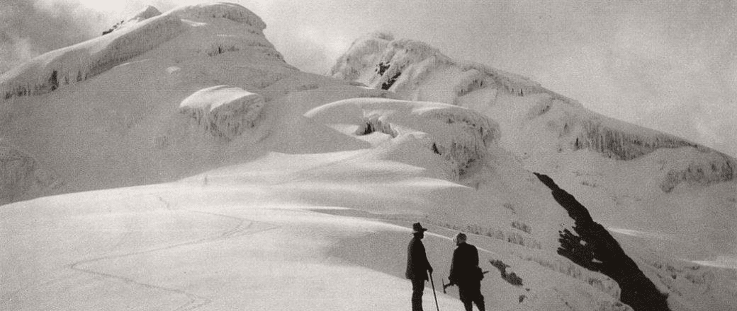
Al seleccionar la imagen de referencia para este ejercicio, es crucial elegir una que cumpla con ciertos criterios de calidad. Ya sea digital o impresa, la imagen debe presentar una variedad suficiente de tonos de gris. Para facilitar nuestros primeros intentos, es recomendable optar por una composición relativamente simple, con pocas figuras y formas fáciles de interpretar.
La importancia de la calidad en tus herramientas artísticas
Antes de sumergirnos en el proceso creativo, es fundamental hacer hincapié en la calidad de los materiales que utilizaremos. Realizar pruebas directas sobre el soporte elegido nos ayudará a comprender cómo se comportan nuestros lápices o pasteles, permitiéndonos ajustar nuestra paleta y técnica según sea necesario.
Debemos prestar atención a la capacidad de cobertura de nuestros materiales. ¿Pueden pintar sobre el soporte cubriendo completamente el área y mostrando todo el potencial de su color? ¿O acaso se mezclan con el fondo, produciendo un tono diferente al deseado? Estas observaciones son cruciales para lograr el efecto deseado en nuestro trabajo.
La calidad de los materiales juega un papel fundamental en el resultado final. Por esta razón, no se recomienda utilizar herramientas de tipo escolar para este ejercicio. Lo ideal es contar con materiales semiprofesionales que nos permitan explorar todo el potencial de esta técnica. ¿Quieres saber más sobre cómo elegir los mejores materiales para tus ilustraciones? Ingresa aquí para descubrirlo.
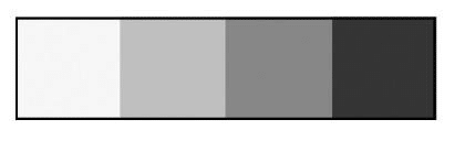
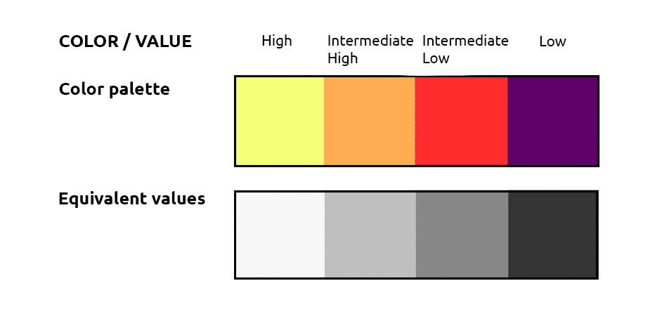
Dominando la escala de valores: Tu guía para el éxito
Para este ejercicio, trabajaremos con una escala de valores simplificada que nos permitirá capturar la esencia de la luz y la sombra en nuestras creaciones:
- Alto (blanco)
- Intermedio alto (gris claro)
- Intermedio bajo (gris oscuro)
- Bajo (negro)
Paso a paso: Creando tu obra maestra a color
Paso 1: La elección del lienzo cromático
El primer paso en nuestro viaje artístico es seleccionar una hoja de color que servirá como base para nuestra creación. Esta elección es crucial, ya que el tono del papel determinará en gran medida cómo interactuarán los demás colores que apliquemos.
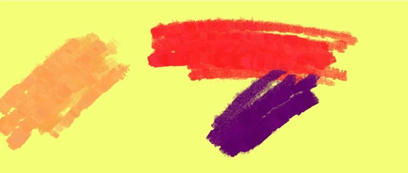
Al elegir el color de la hoja, debemos considerar cuidadosamente qué posición ocupa ese tono en nuestra escala de valores. Por ejemplo, en nuestra demostración, hemos optado por un tono amarillo, que representa un “valor alto” en nuestra escala. Esta decisión influirá significativamente en cómo abordaremos el resto de la composición.

Paso 2: Curar tu paleta perfecta
Una vez que hemos establecido nuestra base con la hoja de color, el siguiente paso es seleccionar cuidadosamente los colores que compondrán nuestra paleta. Esta selección debe complementar y equilibrar el valor del tono de la hoja, asegurándonos de cubrir todo el espectro de nuestra escala de valores.
Siguiendo con nuestro ejemplo, donde el amarillo del soporte nos proporciona el valor alto, podríamos completar nuestra paleta de la siguiente manera:
- Anaranjado (valor intermedio alto)
- Rojo (valor intermedio bajo)
- Violeta (valor bajo)
El objetivo es crear una paleta que nos permita representar toda la gama de valores utilizando únicamente tonos puros, sin mezclas. Esta aproximación nos ayudará a simplificar el proceso y a enfocarnos en la relación entre color y valor.
Paso 3: Dar vida a tu visión
Ahora llega el momento emocionante de trasladar nuestra visión al papel. Utilizando la fotografía de referencia que hemos seleccionado, comenzaremos a analizar e interpretar la variedad de grises presentes en la imagen. Nuestro objetivo es organizar estos tonos dentro de la escala de valores que hemos establecido, pero utilizando los colores equivalentes de nuestra paleta.
El proceso implica observar detenidamente la imagen y agrupar las áreas según su valor: identificar dónde se encuentran los valores altos, intermedios y bajos. Luego, trabajaremos en nuestro dibujo, abordando cada área de valor por separado, pero utilizando nuestros propios tonos seleccionados.
En nuestro ejemplo, el amarillo del soporte representa nuestros valores más altos. Observamos que los valores intermedios bajos tienen un gran protagonismo en la imagen de referencia. Por lo tanto, utilizamos nuestro color rojo para representar estas áreas, pintando todos los sectores que corresponden a este valor con planos esquemáticos de rojo.
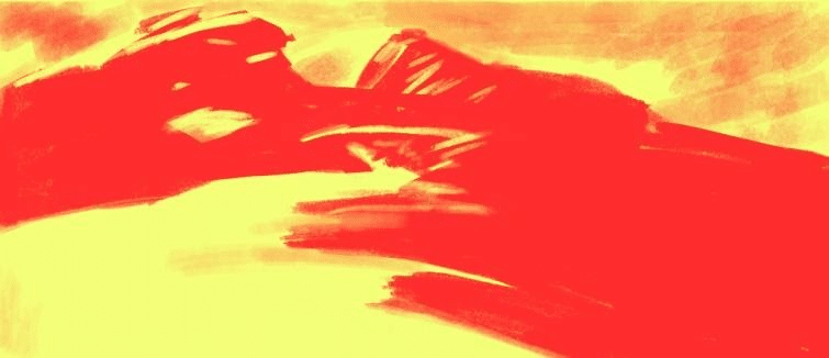
Este enfoque nos permite trabajar de lo general a lo particular, una metodología altamente recomendada que nos ayuda a mantener el orden y la coherencia a medida que avanzamos hacia los detalles. Repetimos el mismo proceso con las zonas de valores bajos, utilizando nuestro color violeta, y con los valores intermedios altos, aplicando el anaranjado.
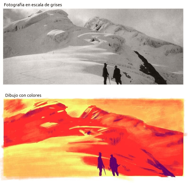
El resultado es sorprendente: sin utilizar blanco ni negro, y sin mezclar colores, hemos logrado trasladar los valores de luz de nuestra referencia fotográfica utilizando únicamente un puñado de colores puros. Este método no solo es eficiente sino también visualmente impactante.
Perfeccionando tu técnica: Consejos para el éxito
A medida que te sumerges en esta técnica, ten en cuenta los siguientes consejos para maximizar tu aprendizaje y resultados:
- Selección cuidadosa dela referencia: Dedica tiempo a encontrar imágenes que faciliten este ejercicio. Busca fotografías con una variedad clara de grises que abarquen todo el espectro de la escala (Alto – Intermedio Alto – Intermedio – Intermedio bajo – Bajo), con áreas bien delimitadas y distinguibles.
- Experimentación constante: Como con cualquier técnica de dibujo y color, la práctica es fundamental. Intenta este ejercicio múltiples veces, variando el color de tu soporte y tus paletas. No te desanimes si los primeros intentos no salen como esperabas; cada experiencia es una oportunidad de aprendizaje.
- Observación aguda: Desarrolla el hábito de observar el mundo en términos de valores de luz. Lleva tus materiales contigo y practica este método de dibujo directo en colores dondequiera que vayas. Esta práctica constante agudizará tu percepción de los valores tonales en tu entorno.
- Flexibilidad creativa: Aunque este ejercicio se basa en una técnica específica, no temas experimentar y adaptar el método a tu estilo personal. La creatividad florece cuando se desafían los límites.
Elevando tu arte: Más allá del ejercicio
Este truco para dibujar con colores es solo el comienzo de un emocionante viaje artístico. A medida que domines esta técnica, descubrirás que tu comprensión del color y el valor se profundiza, permitiéndote crear obras cada vez más sofisticadas y expresivas. ¿Ansioso por llevar tus habilidades al siguiente nivel? Haz clic aquí para explorar recursos avanzados.
Recuerda, el verdadero poder de esta técnica radica en su capacidad para liberarte de las convenciones del color local, permitiéndote explorar nuevas formas de expresión visual. Cada vez que apliques este método, estarás desarrollando no solo tu habilidad técnica, sino también tu voz artística única.
Conclusión: Tu paleta, tu voz
A lo largo de este artículo, hemos explorado la importancia fundamental del color en el dibujo y cómo, con el conocimiento y la práctica adecuados, puedes transformar tus ilustraciones en obras vibrantes y llenas de vida. El truco que hemos compartido hoy no es solo una técnica, sino una puerta de entrada a un mundo de posibilidades creativas.
Recuerda, la maestría en el uso del color no se logra de la noche a la mañana. Requiere práctica, paciencia y, sobre todo, la voluntad de experimentar y aprender de cada trazo. El ejercicio que te hemos proporcionado es una herramienta poderosa en tu viaje artístico. Úsalo, adáptalo y, lo más importante, diviértete con él.
No te desanimes si tus primeros intentos no salen exactamente como esperabas. Cada dibujo, cada experimento con el color, es un paso adelante en tu desarrollo como artista. La clave está en la persistencia y en mantener viva esa chispa de curiosidad y entusiasmo por aprender.
Así que toma tus materiales, elige tu paleta y deja que tu creatividad fluya. Con cada dibujo, estarás un paso más cerca de dominar el arte del color y de encontrar tu voz única como artista. ¿Listo para sumergirte más profundo en el mundo del arte y la ilustración? Descubre recursos exclusivos aquí.
¡Hasta la próxima, y que tus creaciones brillen con todos los colores del arcoíris!


